Magic Wand - 3D and 2D Graphics, Animation, Modeling and Product Visualisation solutions

Magic Wand is a initiative by a team of professionals who pursue the CG world as a serious profession. Areas of expertise: 3D modeling, product and architecture visualization, video editing, logo design, brochure design, web design & development, and 2D Graphic designing various media. Through this blog we will be sharing our design workflow with the world. We also provide simple do it yourself 3D tutorials written by expert artists in the Magic Wand team.

Animating a character flipping or spinning around can be a hurdle in 3d. A character will forward flip over a different center of gravity then if it were to spin around 180 degrees on its right heel. Typically the solution is to set up a hierarchy of groups with pivots at different locations in which the animator can choose to rotate individually as needed. The problem with this solution, besides the redundancy of having so many group nodes to dig through, is that it takes a heavy amount of preplanning to pull it off cleanly. The idea here is to make one control that will easily move around the character's center of gravity in order to rotate the character as a whole around that center.

Let it be clear that this is a MOVABLE pivot not an ANIMATABLE pivot. What that means is that it is generally a one time deal per shot. Once the control starts rotating, translating it can cause some very funky results. If you have a character that is walking and then you use the movable pivot to make it turn left 90 degrees on its heel, trying afterwards to move the pivot over to the right heel will cause the character to translate oddly. However, if the character does a forward flip 360 degrees (essentially rotating the control back to its initial orientation), then the control can be moved and used again.

1. Create a locator (create > locator), name it "objectLocator"
this will represent the character rig or object to be rotated at different centers

2. Group objectLocator to itself and name the group "locatorBuffer"
this is where the movable pivot will do its work leaving the objectLocator free to be transformed as needed underneath

3. Create a nurbs circle (create > nurbs primitives > circle), name it "movable pivot"
this will represent the movable pivot control that is simply translated into place and then rotated


4. Open the connection editor (window > general editors > connection editor), select the movablePivot control and click Reload Left in the connection editor then select the locatorBuffer group and click Reload Right in the connection editor

5. Find and click the translate attribute on the left side to select it and then find and click rotate pivot on the right side to make the connection. This will lock the Rotate Pivot of the buffer node to the translate values of the movable pivot. Next we need to connect the rotation of the movable pivot to that of the buffer node so find and click rotate on the left side to select it and then find and click rotate on the right side to make the connection


6. Thats it! try moving around the movablePivot control and rotating it. Simple right?

7. If you got something out of this technique or found another use for it please let me know below. here's the completed scene movablePivot.mb

Timing for Animation
by Harold Whitaker and John Halas
Prefaced by John Lasseter:
"The principles of timing laid out in this book are more applicable (now) than ever before."

The Animator's Survival Kit
by Richard Williams
The definitive
book on animation, from the Academy Award-winning animator behind Who Framed Roger Rabbit?

Cartoon Animation
(The Collector's Series)
by Preston Blair
" I've been in or near the cartoon business for 50 years and Preston Blair's "Cartoon Animation" played a big role in my education. " (view it on-line : www.freetoon.com)

Cartoon Animation
(How to Draw and Paint series)
by Preston Blair
Walter Foster's classic How to Draw and Paint series provides aspiring artists with an exceptional array of art instruction books featuring all subject areas and media. Each title includes easy step-by-step exercises as well as finished illustrations or paintings that will inspire artistic talent in anyone.

Acting for Animators

by Ed Hooks, Brad Bird, Mike Caputo (Illustrator)
Acting for Animators covers a lot of ground that doesn't get addressed much in animation school. Sure, we're all told to make the character "live and breathe", but most of the info that follows that admonition is from an art perspective. Hooks draws on his acting training and experience to give a different set of tools animators can use to reach that goal. The information on psychological gestures alone is worth the cost of the book (there's something you don't hear about in your Maya classes).

The Illusion of Life:
Disney Animation
by Frank Thomas, Ollie Johnston (Contributor), Cllie Johnston
Equivalent to a Holy relic, this masterpiece of a book has inspired me, not only to appreciate Disney's work, but also the animators and animation in general. If you are considering entering the animation field, in particular working for Disney, then by all means purchase this book and read it thouroughly. 2 of the Old Nine Men, Ollie Johnston and Frank Thomas, wrote this book sometime in the early eighties.

The Animator's Workbook

by Tony White
This book is one of the best all round books used to learn animation techniques; a perfect text for teachers. Animation techniques are illuminated from squash and stretch, to stop action puppet, to cell painting. Included is a great reference section for finding unique materials and building your own animation stand. This is more than a simple how to do manual. It is a companion to any future artist animator for it opens the reader to the sophisticated path of animation as tool articulate movements rather than simply as a squash and stretch manipulator of cartoon characters.

Animation from Script to Screen

by Shamus Culhane
Shamus Culhane is one of the world's best animators. He created the walk cycle of the seven dwarfs in snow white. He demonstrated each characters personality walking in a line. All the characters are in synch. Amazing. He explains the basics of animation. This book is a great way to understand the techniques of hand drawn animation

Hi friends,

It’s been long time with you. Actually I was enjoying my holidays…let me show what I got. It’s something about UV Mapping in 3ds Max with Photoshop. I think some of you have a clear idea, but those who are not aware of that…just read on…

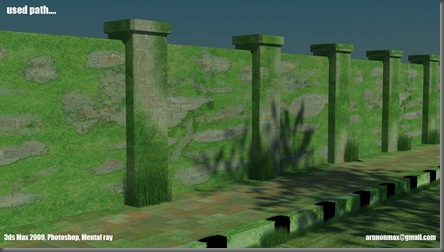
I want to create a pavement like this…

final

I have almost completed the scene except the foot path that is covered in grass..

pic1

First we will apply one Unwrap UVW Modifier to our object and in its sub level, we will select face. And in the parameters go for Edit

pic3

After that, u will get the unwrapped texture of your object, for easy editing, we will Flatten the UV from Mapping> Flatten Mapping

pic4

Now the Exporting Section, From Tools, access the Render UVW Template and in that box, render your Template and save the Image as a Tiff file

pic5

Open the saved Tiff file in your favorite Image Editor (I used Photoshop)

For the footpath, I used one map from 3ds Max directory, place the image in your UV map as in the picture and save your file

pic9

Apply the same map in your object as a bitmap(i think that's very simple).You will get a result similar to this in 3ds Max

pic10

Continue working on your Image like the picture shown.

pic11

After completing the first session, you will get a result like this. The problem is now the footpath looks like its new, our intention is to make it dirty…

pic12

Okay we will do one thing, we will place another image over our existing one like this

pic13

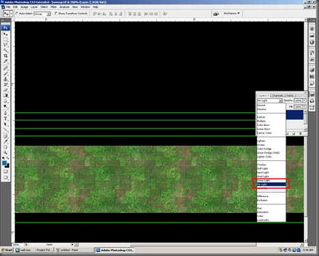
After covering the entire area with Grass picture, in the layer window, change the blending mode to Pin light

pic14

Save your work frequently, then only Max will update…I think you got a result similar to this…

pic15

Now for the final part…use any method for creating a black & white border like this. And make it dirty with the same techniques.

pic17

Isn’t it very easy? See you soon…


3D software tends to range in complexity and sophistication, although these days even the simplest 3D software is capable of impressive results. However, choosing the right 3D program is not a trivial matter, nor is it an easy one. There are many factors to take into account, and your choice will also depend on your intentions. Do you just want to dabble or include a little 3D rendering in your website? Perhaps you are a 2D designer and want to start incorporating 3D in your illustration work. Maybe you have learned about 3D using free software and intend to pursue 3D as a career. Here we will go over the options available in three general sectors of the market: beginner, intermediate, and advanced. Most 3D programs are available as demo versions, so you can try them out and get a feel of how they work before committing any of your hard-earned cash.

Basic

At the bottom end of the market there are plenty of low cost, easy to use 3D programs. Because of the low cost and small market share, this is a volatile sector, with 3D applications popping into and out of the market quite rapidly. Some of these applications last a little longer than normal, while others vanish without a trace, so don't be surprised if any mentioned here are no longer available by the time you read this! Whatever the name, they all tend to follow the same basic path-making 3D as easy as possible, but without the power and finesse of the more expensive packages.

If you want something for nothing, there are a few freeware versions of 3D packages available. 3D Canvas from amabilis.com is a cut down version of the company's commercial 3D packages. It's a fully functional 3D application but is probably more suited to the intermediate 3D users or keen beginners.

Xara 3D is a typical low end 3D package, still going strong after multiple versions. Costing about $39, it's a PC-only 3D program that won't break the bank but is pretty limited as 3D programs go. Xara is great for quick logos and fun titles, but really that is about it.

Adobe Dimension is a plug-in for illustrator (Mac or PC) that generates rendered 3D objects from illustrator curves and text. Again, it's limited but very simple to use, and for some it's all that is needed.

Although more suited to intermediate users, Amorphium from ElectricImage Inc. is an esy to use 3D program designed to work in a very hands on way. If you want to sculpt 3D objects as if they were lumps of clay then render them very simply, it's a good way to go.

Poser is included here because it is so easy to use, but in fact it's usefulness extends right up to the pro level. It's a 3D character renderer and animator that lets you pose and animate ready-made, high quality 3D figures. It's very powerful, but it's not an all rounder- it does one thing only-but does it very well.

Intermediate

The quality of intermediate 3D software can vary, but there are a few things to bear in mind. Make sure the rendering is up to speed, and examine online galleries of the software, which you can usually find on the developer's site. This will usually give you a good idea of the quality on offer. Most of the programs are available as demo versions, so they can be downloaded for evaluation.

Strata's Strata 3D has a long history and is available for Mac and PC. It's a sturdy if slightly archaic 3D program, but it has found favor with many digital illustrators. It has some good rendering features, including radiosity, which are rare at the price. www.strata3d.com

Pixels is a Mac-only 3D program that offers advanced rendering and animation and robust modeling for a modest cost. It also features a renderer based on the REYES algorithm-the same one used in Pixar's RenderMan software.

Corel's Bryce 3D is an interesting 3D program. It's primarily a landscape rendering application, designed to produce skies, seas, and terrains in a very efficient way. It can be pressed into service as a more general purpose 3D tool, but lacks any serious modeling tools. www.corel.com

One of the best free 3D applications available is Blender. This program is a full featured 3D production package featuring the kinds of tools you'd expect to see in a mid to high end application.

Advanced

At the high end level of 3D applications, it's not so much the tools as their implementation that makes the difference, and each 3D application listed here has its own style of working. Some of these applications are costly, seriously powerful, and used for many high-end effects in movies and television.

Newtek's Lightwave 3D is a dual application featuring separate modeler/texturing and animation/lighting/rendering apps. Its quirky interface is deceptively powerful, and it offers one of the best quality renderers out there.

Softimage XSI combines sublime modeling with non-linear animation, scripting, and phenomenal rendering through tight integration with Mental Images' Mental Ray rendering software. It also features an integrated 2D/3D compositor.

Alias's Maya 3D is extremely powerful. Its node-based architecture enables complex animation and rendering linkages to be created and it offers a nonlinear modeling history, plus Mental Ray rendering.

Discreet's 3Ds Max has always been a popular choice. Its design is not as modern as Maya or Softimage but it holds its own, especially in the games production market, and comes with Mental Ray rendering as standard.

Houdini is a fully procedural animation system that takes the node-based architecture to the nth degree. Sublimely powerful, it's not for the faint hearted, but offers the kind of flexibility other applications only hint at.

The full suite of plug-ins for Cinema 4D takes it into the high end. With advanced radiosity rendering, sophisticated character tools, and a GUI based expression system, it's also one of the easiest high-end 3D apps to get to grips with.

Now, go forth and create!


Is Photoshop driving you up the wall? Here are 15 simple tips to make using Photoshop easier.

1. When working on a colour image, you can use the Paint Brush tool to selectively "paint away" colour to black and white. It can make one portion of your image really stand out. In the Paint Brush Options palette, change the blend mode to Colour, and paint away the colour

2. When using your magic wand tool you can press your Shift to add more to the selection, or press your Alt to take away from the selection.

3. If you have a lot of images to display, use Photoshop's image gallery to build a webpage of images that are thumbnailed for you. FILE > Automate > Web Images Gallery

4. Double click on the 'T' on a Type layer in the Layers Palette to automatically select the entire text layer. There are at least two ways to switch between the various measurement units that Photoshop displays.

5. One is to change them in your Preferences by going to the Photoshop menu under Preferences and choosing Units & Rulers (in Photoshop 7 under Mac OS 9, Preferences is found under the Edit menu). From here you can change the ruler units and click OK.

6. The second way is to open the Info Palette (go to the Window menu and choose Info) and click on the small triangle next to the cross in the lower left quadrant. This will bring up a menu that will allow you to change units on the fly.

7. To cycle through different screen modes, simply press the F key

8. You can select only the pixels and not the transparency area of the layer by holding the Cmd/Ctrl key and clicking the mouse on that layer in the Layers palette.

9. Do you have a layer style you like to use a lot? You can save that layer style as a style that will show up in your styles palette. In the Blending Options, just under OK and Cancel you'll see 'Save Style'. Name it and save it. You'll then find this new style in the Styles palette. Note: the style must be in its own layer.

10. Sometimes when you combine multiple images, there will be a bit of fringe around the edges of the composite images. Often you can hide this by going to Layers > Matting > Defringe. At the dialogue box, choose the default setting; it that doesn't work, undo it, and try Defringe again at a setting of 2.

11. Got too many layers? Simply select the right layer by using the move tool ( V ) Right click the mouse over the layer and a drop down list will come up. Alternatively, you can put your layers in layer sets. On the bottom of your layers palette, click the create new layers set (looks like a folder), name the new layer set, and just drag the layers you like in that set. Great for coping a set too. Highlight the set right click and copy.

12. If you want to toggle between Photoshop and ImageReady, press Shift-Command-M (Mac)/ Shift-Control-M (PC).

13. To access the Save for Web dialogue quickly, press Shift-Command-Option-S (Mac)/ Shift-Control-Alt-S (PC).

14. If you want to duplicate your current layer, press Cmd/Ctrl J.

15. To bring up the Extract dialogue box, press Command-Option-X (Mac)/ Control-Alt-X (PC). Within the Extract dialogue box, switch to the Extract Edge Highlighter tool by pressing the letter "b.", the Fill tool by pressing the letter "k.", and change the Edge Highlighter's brush size by holding the ] key to make it larger and the [ to make it smaller.


Tips On Getting Started: there are a number of ways to start the process of learning animation. One is to buy books and teach yourself. The Bible of the industry is the "Illusion of Life" by Frank Thomas and Ollie Johnston. The information and drawings in this book make it worth the fifty dollars or more that you will pay for it. These 12 principles became the gospel according to the nine old men of animation that worked with Walt Disney in founding the industry that you see today. Don't just read it; memorize it, learn it and use it every time you draw. There is no short cut for skills and knowledge. It all starts with heart and desire; do you have it?

THE 12 BASIC PRINCIPLES OF ANIMATION Paraphrased from the "Illusion Of Life" by Frank Thomas & Ollie Johnston.(pp.47-69) Look these up and read the original version for a complete understanding.

1. Squash and stretch

2. Anticipation

3. Staging

4. Straight Ahead Action and Pose to Pose

5. Follow Through and Overlapping Action

6. Slow In and Slow Out

7. Arcs

8. Secondary Action

9. Timing

10. Exaggeration

11. Solid Drawing

12. Appeal

1. SQUASH AND STRETCH

This action gives the illusion of weight and volume to a character as it moves. Also squash and stretch is useful in animating dialogue and doing facial expressions. How extreme the use of squash and stretch is, depends on what is required in animating the scene. Usually it's broader in a short style of picture and subtler in a feature. It is used in all forms of character animation from a bouncing ball to the body weight of a person walking. This is the most important element you will be required to master and will be used often.

2. ANTICIPATION

This movement prepares the audience for a major action the character is about to perform, such as, starting to run, jump or change expression. A dancer does not just leap off the floor. A backwards motion occurs before the forward action is executed. The backward motion is the anticipation. A comic effect can be done by not using anticipation after a series of gags that used anticipation. Almost all real action has major or minor anticipation such as a pitcher's wind-up or a golfers' back swing. Feature animation is often less broad than short animation unless a scene requires it to develop a characters personality.

3. STAGING

A pose or action should clearly communicate to the audience the attitude, mood, reaction or idea of the character as it relates to the story and continuity of the story line. The effective use of long, medium, or close up shots, as well as camera angles also helps in telling the story. There is a limited amount of time in a film, so each sequence, scene and frame of film must relate to the overall story. Do not confuse the audience with too many actions at once. Use one action clearly stated to get the idea across, unless you are animating a scene that is to depict clutter and confusion. Staging directs the audience's attention to the story or idea being told. Care must be taken in background design so it isn't obscuring the animation or competing with it due to excess detail behind the animation. Background and animation should work together as a pictorial unit in a scene.

4. STRAIGHT AHEAD AND POSE TO POSE ANIMATION

Straight ahead animation starts at the first drawing and works drawing to drawing to the end of a scene. You can lose size, volume, and proportions with this method, but it does have spontaneity and freshness. Fast, wild action scenes are done this way. Pose to Pose is more planned out and charted with key drawings done at intervals throughout the scene. Size, volumes, and proportions are controlled better this way, as is the action. The lead animator will turn charting and keys over to his assistant. An assistant can be better used with this method so that the animator doesn't have to draw every drawing in a scene. An animator can do more scenes this way and concentrate on the planning of the animation. Many scenes use a bit of both methods of animation.

5. FOLLOW THROUGH AND OVERLAPPING ACTION

When the main body of the character stops all other parts continue to catch up to the main mass of the character, such as arms, long hair, clothing, coat tails or a dress, floppy ears or a long tail (these follow the path of action). Nothing stops all at once. This is follow through. Overlapping action is when the character changes direction while his clothes or hair continues forward. The character is going in a new direction, to be followed, a number of frames later, by his clothes in the new direction. "DRAG," in animation, for example, would be when Goofy starts to run, but his head, ears, upper body, and clothes do not keep up with his legs. In features, this type of action is done more subtly. Example: When Snow White starts to dance, her dress does not begin to move with her immediately but catches up a few frames later. Long hair and animal tail will also be handled in the same manner. Timing becomes critical to the effectiveness of drag and the overlapping action.

6. SLOW-OUT AND SLOW-IN

As action starts, we have more drawings near the starting pose, one or two in the middle, and more drawings near the next pose. Fewer drawings make the action faster and more drawings make the action slower. Slow-ins and slow-outs soften the action, making it more life-like. For a gag action, we may omit some slow-out or slow-ins for shock appeal or the surprise element. This will give more snap to the scene.

7. ARCS

All actions, with few exceptions (such as the animation of a mechanical device), follow an arc or slightly circular path. This is especially true of the human figure and the action of animals. Arcs give animation a more natural action and better flow. Think of natural movements in the terms of a pendulum swinging. All arm movement, head turns and even eye movements are executed on an arcs.

8. SECONDARY ACTION

This action adds to and enriches the main action and adds more dimension to the character animation, supplementing and/or re-enforcing the main action. Example: A character is angrily walking toward another character. The walk is forceful, aggressive, and forward leaning. The leg action is just short of a stomping walk. The secondary action is a few strong gestures of the arms working with the walk. Also, the possibility of dialogue being delivered at the same time with tilts and turns of the head to accentuate the walk and dialogue, but not so much as to distract from the walk action. All of these actions should work together in support of one another. Think of the walk as the primary action and arm swings, head bounce and all other actions of the body as secondary or supporting action.

9. TIMING

Expertise in timing comes best with experience and personal experimentation, using the trial and error method in refining technique. The basics are: more drawings between poses slow and smooth the action. Fewer drawings make the action faster and crisper. A variety of slow and fast timing within a scene adds texture and interest to the movement. Most animation is done on twos (one drawing photographed on two frames of film) or on ones (one drawing photographed on each frame of film). Twos are used most of the time, and ones are used during camera moves such as trucks, pans and occasionally for subtle and quick dialogue animation. Also, there is timing in the acting of a character to establish mood, emotion, and reaction to another character or to a situation. Studying movement of actors and performers on stage and in films is useful when animating human or animal characters. This frame by frame examination of film footage will aid you in understanding timing for animation. This is a great way to learn from the others.

10. EXAGGERATION

Exaggeration is not extreme distortion of a drawing or extremely broad, violent action all the time. Its like a caricature of facial features, expressions, poses, attitudes and actions. Action traced from live action film can be accurate, but stiff and mechanical. In feature animation, a character must move more broadly to look natural. The same is true of facial expressions, but the action should not be as broad as in a short cartoon style. Exaggeration in a walk or an eye movement or even a head turn will give your film more appeal. Use good taste and common sense to keep from becoming too theatrical and excessively animated

11. SOLID DRAWING

The basic principles of drawing form, weight, volume solidity and the illusion of three dimension apply to animation as it does to academic drawing. The way you draw cartoons, you draw in the classical sense, using pencil sketches and drawings for reproduction of life. You transform these into color and movement giving the characters the illusion of three-and four-dimensional life. Three dimensional is movement in space. The fourth dimension is movement in time.

12. APPEAL

A live performer has charisma. An animated character has appeal. Appealing animation does not mean just being cute and cuddly. All characters have to have appeal whether they are heroic, villainous, comic or cute. Appeal, as you will use it, includes an easy to read design, clear drawing, and personality development that will capture and involve the audiences interest. Early cartoons were basically a series of gags strung together on a main theme. Over the years, the artists have learned that to produce a feature there was a need for story continuity, character development and a higher quality of artwork throughout the entire production. Like all forms of story telling, the feature has to appeal to the mind as well as to the eye.

I hope this article gave you a better understanding about animation. You can visit a couple of links I found online for further reference

Link 1

Link 2


Stop Motion Animation is a very creative hobby. It is also very inexpensive to start out in; and you can probably do it for no cost at all. All you need is a typical digital camera, some basic software, and a few ideas. Here are some thoughts and tips to get your creativity flowing in this hobby.

When thinking about doing some kind of animation you have to think outside the box and realize that just about anything at all will make a good subject. And you have to think about the fact that just about any medium will work well also.

Two Dimensional Ideas

Working in two dimensions gives you a lot of creative and inexpensive options. You can simply draw pictures on paper and erase then redraw them to show the motions you want to make. An alternative to erasing is to draw series of pictures on separate sheets of paper and photograph them individually. This can give you extraordinary results but is very challenging to make sure the images stay cleanly tracked without slippage which would make it very jerky and shaky.

An excellent way to draw pictures is to use some kind of an erasable surface. This tends to be much easier than drawing pictures on paper and two excellent mediums for this are the dry erase board and the chalkboard. These make it very easy to erase potions of your drawing and redraw the motions. I highly recommend using a dry erase board if you want to get some great looking animations and if you have some skill in drawing.

Drawing images of figures and objects then cutting them out and using them in animations is an excellent way to get very creative and very expressive animations. There are two important additions you can make to this style of animation. You can cut the drawing into segments to show motion. An example of this would be to draw a human form then cut it into its different parts like arms, legs, head and torso. This way you can move them individually much as a human moves. Another way to enhance cut out drawings is to make multiple drawings of the same object to show motion or rotation. A good example of this would be a face. You would draw multiple faces such as one with the mouth closed and one with the mouth open. This way you can alternate between the drawings and simulate talking.

Three Dimensional Animation

There are some exciting possibilities available to you when you start to think about doing animation in three dimensions. And the first place you could start is with clay or play-doh. If you don’t have any of these materials you can easily make some out of flour, salt and water. Another very simply yet very expressive technique is to use wire. You can easily shape it into figures and objects. It holds its shape well yet is easy to manipulate into simulations of motion. Wire is so effective that it is often the frame over which many modern figures are made. This technique is called using a wire armature.

Action figures and dolls make great animation subjects as long as they have movable joints and body parts so you can articulate them. But you don’t have to stick with that. Just about any three-dimensional object can be used in interesting ways. You can draw small eyes, noses, and mouths then attach them to any object and come up with an interesting anthropomorphic little project. You can even carve potatoes or apples and get some great videos. And just moving objects around can be the source of some interesting videos. Watching furniture move around a room can be a good idea or watching items move around a desk can also be interesting.

Animating yourself and the real world is also a fun way to approach the hobby. If you stand at attention and take a picture then move forward six inches, stand at attention and take another picture you can come up with a great series of pictures that show you magically sliding around without moving your feet. You can also do the same thing by jumping into the air and snapping a picture of yourself. Move forward six inches, jump, and snap another picture. With this technique you can create an animation that shows you floating around.

Some final tips

Don’t forget the camera. If you really want to make your animations special you should move the camera as you take your series of pictures. You can do this by either zooming in or out or panning from side to side. This moving of the camera is the single best way to make your animations stand out.

While the medium you use for your animation is very important and can turn a plain animation into something special to look at you should put some time and thought into the story of the animation. This is what can turn it into something truly remarkable. Surprise your viewers and keep them guessing as to what will happen next.

Just about anything in your every day world can be transformed into something extraordinary with a little bit of animation magic and a little bit of creativity. Just look around your house and you will discover lots of great ideas.


For more stop motion animation project fun visit Will’s website at:STOP MOTION ANIMATION - Limitless creativity